On-chain Culture
Why Crypto People Love Maps and Globes
Why maps and globes keep appearing in crypto culture, from node maps and adoption charts to community pins, and how geography helps a borderless industry feel human.
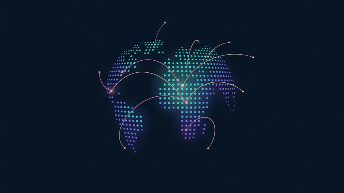
Crypto describes itself as borderless, yet the industry is full of maps. Node distribution maps show where networks run. Conference websites display world maps of attendees. Communities pin their members' cities. Project websites show glowing globes with lines between continents. There is something about geography that pulls at a global, online movement.
Maps make networks visible
Blockchains are invisible by design. You cannot see a validator or a transaction the way you can see a building. Maps give that invisible activity a shape. A world map dotted with nodes turns abstract claims about decentralisation into something people can grasp in a second.
When a network says it runs on thousands of machines across dozens of countries, a map is the most convincing way to show it.
Proof of global reach
For projects, a map is shorthand for ambition and reach. A community map showing members in many countries signals that the project matters beyond one city. Investors, partners and new users read that signal quickly.
This can be overused. A glowing globe on a landing page does not make a project global. Maps work best when they show real data, such as actual users, contributors or events.
Belonging in a borderless space
Online communities can feel anonymous. Maps add a human layer. When members add their city to a shared map, they see that people from their region are involved too. A member in Lagos, Lisbon or Manila sees neighbours on the map and feels less alone in a large, English-dominated space.
Regional pride also plays a part. Communities love representing their country or city, and projects with strong local groups often see those groups promote the project more actively.
Time zones and coordination
Geography matters practically as well. Global teams plan launches around time zones. Community calls rotate times so different regions can attend. Maps help teams see where their users are and when they are awake. A launch at midnight in the largest community's time zone wastes attention.
Globes as a design language
Globes have become part of crypto's visual style, alongside dark backgrounds, gradients and glowing lines. Part of the appeal is symbolic. A globe suggests a single connected system, which matches the idea of open networks. Part of it is simply that globes look good in motion and hold attention on a landing page.
The design trend has pushed builders to make globes interactive, with real data points people can explore.
Maps people can join
The most engaging maps let people add themselves. A static map is decoration. A map you can join is participation. Examples in crypto culture include:
| Map type | What people add |
|---|---|
| Node and validator maps | Their machines |
| Community member maps | Their city or country |
| Event maps | Meetups and conferences |
| Project maps | Their project and link |
| Collaborative globes | A pin, colour and message |
Every addition makes the map more interesting for the next visitor, which creates a loop of participation.
Honest geography
Maps can mislead. Pins placed for aesthetics, exaggerated user counts or dots representing nothing real damage trust when people notice. Good maps show real entries, explain what each dot means and keep their data current.
Put yourself on the map
Proud Globe is built around this appeal. The globe shows 2,030 tiles of land, with open, Prime and claimed tiles clearly marked. Each claimed tile is a real project, builder or community, with its own page. Spin the globe on the claim page and see where your community would plant its flag.
Educational content only. Nothing here is financial, legal or tax advice. Crypto assets carry risk, so check the details for your own situation.