Crypto Around the World
Accessibility for Global Crypto Users
How to make crypto apps accessible to people with disabilities and diverse devices, covering contrast, screen readers, keyboard navigation, language and motion.
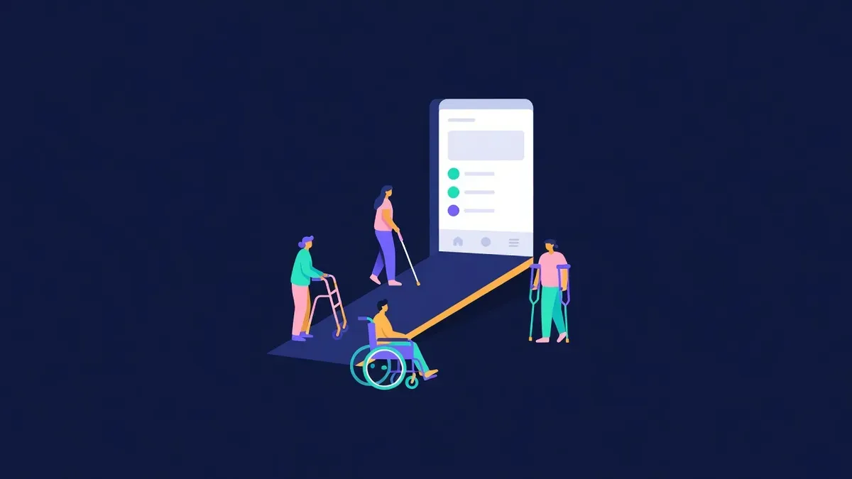
Crypto promises financial access for anyone with an internet connection. Many crypto apps quietly exclude people with visual, motor, hearing or cognitive disabilities, as well as users on older devices or unfamiliar languages. Accessibility is part of making crypto truly global, and many accessibility improvements make apps better for every user.
Why accessibility matters in crypto
Accessibility barriers in crypto can have serious consequences. A user who cannot read a low-contrast warning might approve a dangerous transaction. A screen reader user who cannot identify a button might send funds to the wrong place. Clear, accessible design is also safer design.
Common barriers
| Barrier | Who it affects |
|---|---|
| Low contrast text on dark backgrounds | People with low vision, users in bright sunlight |
| Buttons without labels | Screen reader users |
| Mouse-only interactions | Keyboard and switch device users |
| Tiny tap targets | People with motor impairments, mobile users |
| Heavy motion and flashing effects | People with vestibular disorders or photosensitivity |
| Complex jargon | People with cognitive disabilities, newcomers, non-native speakers |
| Time-limited actions without warning | Users who need more time |
| Content only in images | Screen reader users, slow connections |
Visual accessibility
- Maintain strong contrast between text and backgrounds
- Avoid relying on colour alone to show status, such as red and green
- Allow text to scale without breaking layouts
- Use readable font sizes for amounts and addresses
- Provide text alternatives for images and icons
Dark themes common in crypto need extra attention to contrast.
Screen readers and semantics
Use proper HTML elements and labels:
- Buttons should be real button elements with descriptive text
- Form fields need visible labels connected to inputs
- Status updates, such as payment confirmation, should be announced
- Icons that act as buttons need accessible names
- Tables should use headers for data such as transaction lists
Test with screen readers on desktop and mobile.
Keyboard navigation
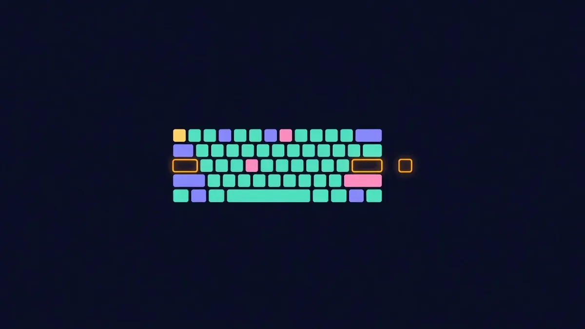
Every action should work with a keyboard:
- Logical tab order through interactive elements
- Visible focus indicators
- No keyboard traps in modals
- Shortcuts that do not conflict with assistive technologies
Wallet connection modals and custom dropdowns frequently break keyboard access.
Motion and animation
Animations can make apps feel alive, but they should respect user preferences. Honour reduced motion settings, avoid flashing content and keep essential information available without animation.
Language and clarity
Plain language helps everyone:
- Explain technical terms in context
- Use short sentences for warnings and confirmations
- Provide clear error messages with next steps
- Offer translations for key flows where possible
Time limits
Payment windows and reservations are common in crypto. Show remaining time clearly, warn before expiry and allow reasonable extensions or grace periods where possible.
Test with real users
Automated accessibility checkers catch some issues, but real users reveal the rest. Invite people who use assistive technologies to test key flows and pay them for their time.
Make accessibility part of the process
Accessibility improves most when it becomes routine rather than a one-time audit. Add accessibility checks to design reviews, include keyboard and screen reader testing in release checklists and fix accessibility bugs with the same priority as other bugs that block users. Keep a short internal guide with the patterns your team uses for buttons, forms, modals and status messages. Over time, accessible choices become the default, and new features launch without the barriers that are expensive to remove later.
Accessible by default
Proud Globe includes skip links, labelled forms, visible focus styles, reduced motion support and a grace period for late payments. There is still more to improve, and feedback through the contact page helps make the globe easier to use for everyone.
Educational content only. Nothing here is financial, legal or tax advice. Crypto assets carry risk, so check the details for your own situation.